Theme Gallery Guide: Install, Edit, and Manage Themes
Manage your store's theme gallery: install new themes, apply or preview them, transfer customisations, and import or export themes between stores.
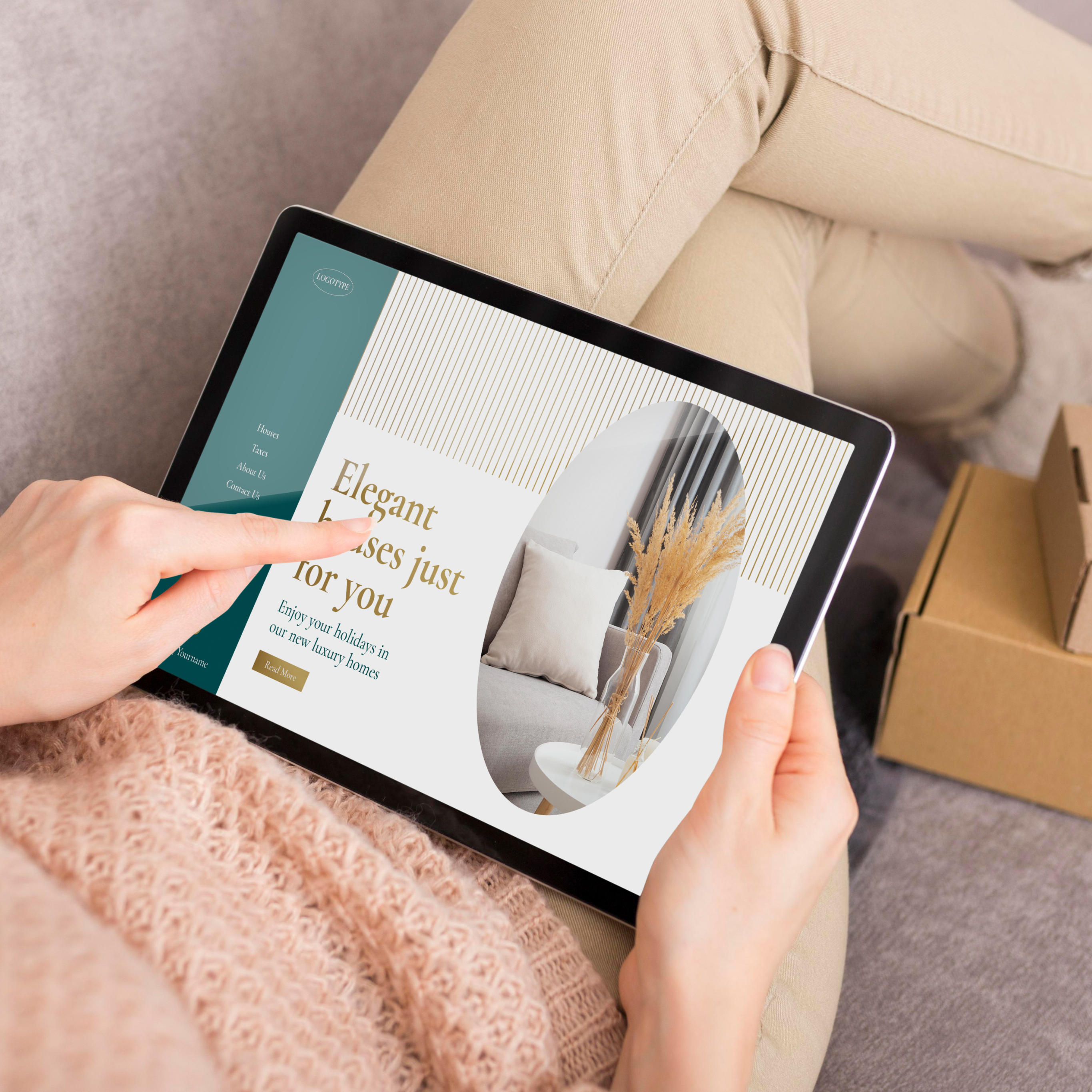
This component allows you to display a section with a maximum of four elements in it: Title, Subtitle, Text and a Link.
It can be useful as a complementary section that goes along with other components of the theme or for example as a “Heading” section.
The options for you to customize this component are the following:
This group of options allow you to add a Title element and customize how it’s gonna look.
This group of options allow you to add a Subtitle element and customize how it’s gonna look.
Note: will be displayed always before the Title.
This group of options allow you to add a Text or Description element and customize how it’s gonna look.
Note: will be displayed always after the Title and before the Link.
This group of options allow you to add a Button link element and customize how it’s gonna look.
Note: will be displayed always as the last element.
This group contains the following options to customize the component:
The Customize options allows to adjust the animations for this specific component. You can read which ones are available on this page.
Start your free 7-day trial. No credit card required.