Theme Gallery Guide: Install, Edit, and Manage Themes
Manage your store's theme gallery: install new themes, apply or preview them, transfer customisations, and import or export themes between stores.
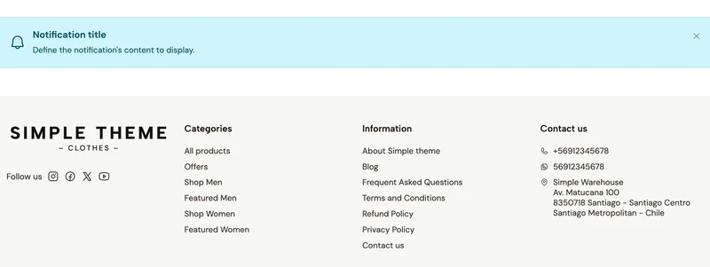
This component lets you display notifications or messages anywhere in your store. Use it to highlight important information, announce promotions, share updates with customers, or anything else you consider relevant.
You can choose from several visual styles and define its position to create different types of alerts or announcements.
Next, you can find the list of options that will allow you to customize it:
This option allows you to define the behavior that the notification will have, based on the following ones:
On grid

This will make the notification to be included at the same level of the rest of the component, before or after the one in which in you add it.
Floating

This will place the notification on top of the rest of the page content, including components as well as Header and Footer.
When choosing this, two additional options will become visible to choose the Horizontal (left, right) and Vertical (top, bottom) position in which it will be displayed.
This option allows you to choose the style of the notification, which is based on the case scenario you want to use it for, based on the following options:
Information

Success

Warning

Danger

Within this group you will find several options to define the content of the component.
Icon
Allows to add an icon, which will be placed at the left side of the notification.
When adding it, an additional option called Icon size will allow you to choose the size it will have.
Title
Allows to add a title on the notification.
Text
Allows to add a text on the notification, that will be displayed after the title, if added.
Link
Allows to add a link that will display at the end of the component. When adding it, two additional options will become visible:
Show close button
Allows to display an X icon at the top right corner, so users are able to close the notification.
You can disable this if you don’t want users to be able to do it.
This group contains the following options to customize the component:
Note: this will become visible only if you choose
On gridwithin theDisplayoption.
The Customize options allows to adjust the animations for this specific component. You can read which ones are available on this page.
Start your free 7-day trial. No credit card required.