Theme Gallery Guide: Install, Edit, and Manage Themes
Manage your store's theme gallery: install new themes, apply or preview them, transfer customisations, and import or export themes between stores.
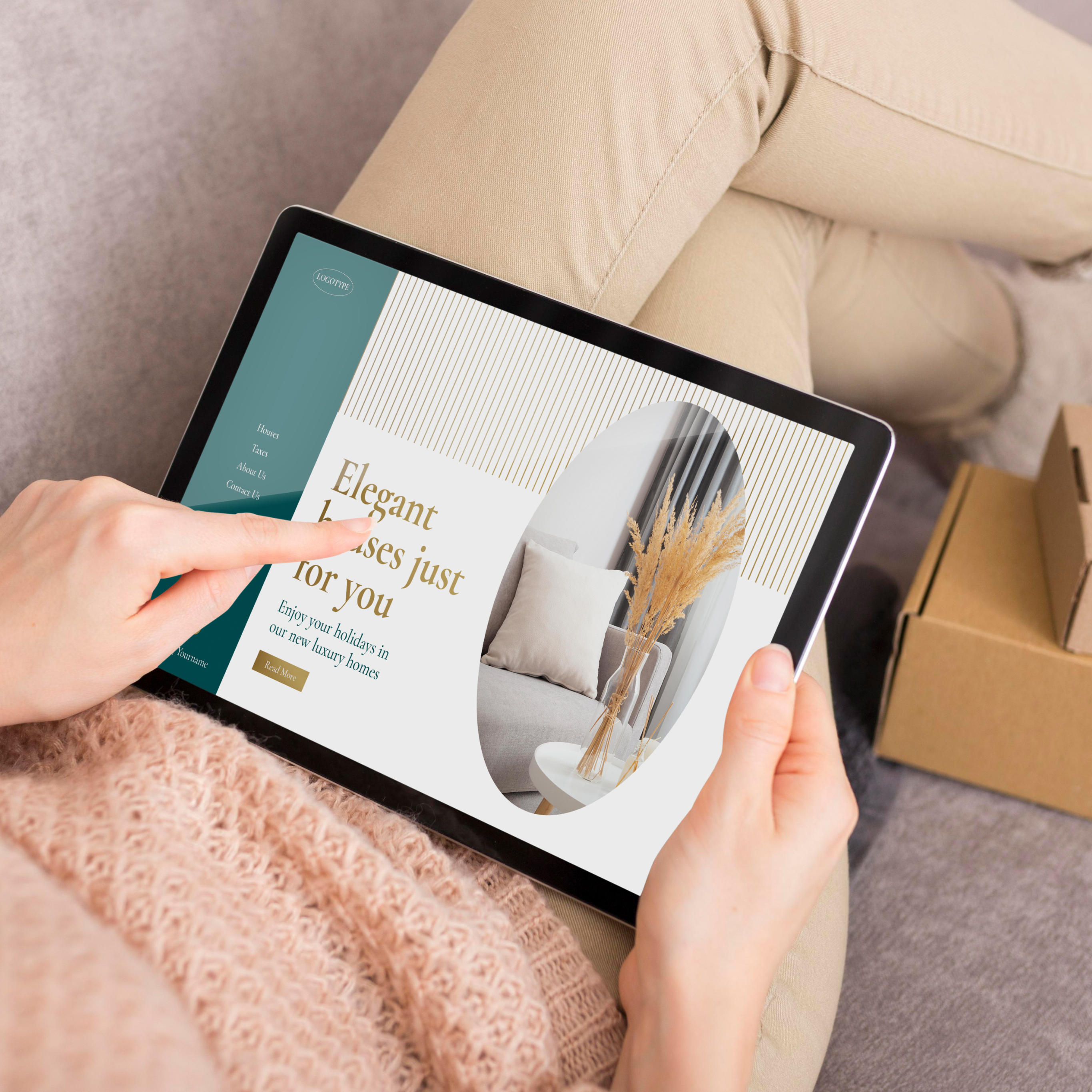
This component allows you to display a section to feature and stand out something about your store. Use cases could be for example:
By clicking on the component name you will find general options to customize it, which will determine how the section will look and behave. The available options for this component are the following:
Allows to define the maximum width that the component will stretch to the browser window.
You can read more about how this option will affect the component on this page.
Note: the size for the images that you can upload will vary depending on the option you chose here. These are explained in detail on this section of the page.
Allows to define which type of *media element will be used as a background of the component:
When choosing Image, the following options will appear to define aspects of them:
Note 1: Vertical and horizontal positioning is most noticeably visible when images are larger than the area of the section, like for example if it has a vertical dimension and the uploaded image has a rectangular dimension.
Note 2: Desktop will consider devices with a width equal or higher than 576px. As for Mobile, will be for devices with a width equal or lower than 575px.
When choosing Video, it will center horizontally and vertically and cover the entire area of the component.
Next, you will find several options for adding a Link to the banner:
If you have enabled the Show Banner content option that’s found below, the following options will be available to be used:
By enabling this option:
The options that will be displayed are the following:
Note 1: We refer to a minimum height, because this will vary depending on the amount and/or length of the content you add within the component.
Note 2: The size for the images that you can upload will vary depending on the combination of width and height that you define. These are explained in detail in this section.
This group contains the following options to customize the component:
Show Banner content is enabled.The Customize options allows to adjust the animations for this specific component. You can read which ones are available on this page.
The suggested minimum dimensions on the tables below will vary depending on the combination from the options Width and Height within the component settings:
The dimension for Desktop devices will consider the ones that have a width equal or greater than 576px, while for Mobile devices the ones that have a width equal or lower than 575px:
Width: Grid
| Height | Desktop | Mobile |
|---|---|---|
| Fit to content | 1320 x 300 px | 575 x 320 px |
| Small | 1320 x 420 px | 575 x 420 px |
| Medium | 1320 x 560 px | 575 x 560 px |
| Large | 1320 x 720 px | 575 x 720 px |
| Browser | 1320 x 850 px | 575 x 820 px |
Width: Medium
| Height | Desktop | Mobile |
|---|---|---|
| Fit to content | 1620 x 300 px | 575 x 320 px |
| Small | 1620 x 420 px | 575 x 420 px |
| Medium | 1620 x 560 px | 575 x 560 px |
| Large | 1620 x 720 px | 575 x 720 px |
| Browser | 1620 x 850 px | 575 x 820 px |
Width: Large
| Height | Desktop | Mobile |
|---|---|---|
| Fit to content | 1920 x 300 px | 575 x 320 px |
| Small | 1920 x 420 px | 575 x 420 px |
| Medium | 1920 x 560 px | 575 x 560 px |
| Large | 1920 x 720 px | 575 x 720 px |
| Browser | 1920 x 850 px | 575 x 820 px |
Width: Extra Large
| Height | Desktop | Mobile |
|---|---|---|
| Fit to content | 2220 x 300 px | 575 x 320 px |
| Small | 2220 x 420 px | 575 x 420 px |
| Medium | 2220 x 560 px | 575 x 560 px |
| Large | 2220 x 720 px | 575 x 720 px |
| Browser | 2220 x 850 px | 575 x 820 px |
Width: Browser
| Height | Desktop | Mobile |
|---|---|---|
| Fit to content | 2800 x 300 px | 575 x 320 px |
| Small | 2800 x 420 px | 575 x 420 px |
| Medium | 2800 x 560 px | 575 x 560 px |
| Large | 2800 x 720 px | 575 x 720 px |
| Browser | 2800 x 850 px | 575 x 820 px |
Note: When defining Browser within the
WidthandHeightoptions, we suggest that you can test how images look among different devices, to ensure that they don’t pixelate.
Start your free 7-day trial. No credit card required.