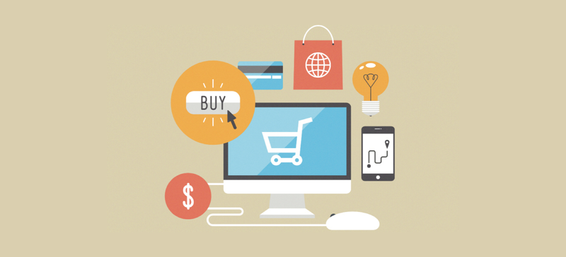
The end goal of conversions is for a customer to make a purchase, and the final stage of making a purchase is to complete the checkout process. If a customer on your online store has arrived at the payment and checkout section, the good news is you have done the hard part.
However, things can still go wrong if your store does not have a good checkout process. In this article, you will find some tips to optimize the checkout experience for your customers.

Blockages
This is the most important rule for creating a good checkout page, avoiding unnecessary blockages like pop-up ads and forms to be filled out. Make sure you are not going to gathering too much information! Keep it down to essentials only. Maybe once the purchase is completed, you can ask customers to sign up for email updates or a newsletter to keep them informed about updates and special offers.
Registrations
Most online store owners want all visitors to be registered. While registrations can be useful, forceful registrations are never a good Idea. Admittedly, registered users will mostly have access to a faster purchasing process as their shipping and payment information will be already filled and it is easy to do retargeting.
However, some people take registration as a source of annoyance. They can link registration to being bombarded with ad campaigns and spam email etc. Hence, when it comes to the checkout process, do not make it essential to register just to make a purchase, unless your business requires it.
You will scare away many potential customers because not every customer wants to give out their information, some just want to make the purchase. Below is a good example of how Nike offer visitors to buy as a guest:

Short and Simple Process
The longer it takes for customers to complete the checkout, the more chances of them doubting the purchase. A lack of indication of the process having an end can generate a sense of uncertainty. It’s highly advisable to make it as simple as possible and clearly show the remaining steps.
Optimal Design
There should be a balance between the design of the page and the ease of functionality! While it is always good to have a visually attractive checkout page, it is wise to not go overboard and make things confusing. Try to have consistency in the design throughout your online store. One thing you can do is to make it clear the visibility of the products in the shopping cart, so they always know what they are buying.
Call to Action
There should be a crystal clear call to action and buttons like “complete order”, “check out” or “complete payment” should be clearly visible and well placed on the page. It is important that the customer never feels lost, and does not know how to complete the purchase. Use complementary colors that draw attention so it will be easy to find.
Redirects
When you use redirects, the customers can become confused about the source of their purchase. They want to be sure that they know which brand, store or company they are purchasing from. If they come across redirects, they might back out of making the purchase just because they are not sure where they are.
Distractions
Usually, at the checkout step customers are filling out important and necessary information with regards to payment and shipping, hence it is easy to make mistakes and create a tedious purchasing process. In the worst case, your customers can get frustrated if the checkout process is not easy to complete. Which is why at this point all distractions should be eliminated and the customers must be able to submit their shipping information, address, name, etc, seamlessly. The payment section must be clearly recognizable, indicating the available payment options. A good example of a simple and precise checkout page is of Kärcher.

Easy Fixes
Many times, when buying online people can make mistakes, they can enter the wrong address, or the quantity of product, or even an incorrect email address. In this case, it should be easy to correct these mistakes, ideally, they should be taken straight back to the particular place where the correction needs to be made. Not only does this make it easier for the customer, it also builds up trust and increases the chance of future purchases.
Security and Privacy
While it is never good to overload the customer with too much information, it is always good to reassure customers about the privacy and security of their data and the transaction that took place. This builds up customer confidence and makes repurchasing more likely. But be careful not to give them a full page description of all the laws you follow, a summary of your privacy policy as a pop-up can do the job.
Lasting Impression
The last thing the customer will do is complete their payment and checkout, so you need to make sure your company leaves a lasting impression. You can show a warm message when the checkout has been completed. This way they leave your online store on a positive note.
Conclusion
The payment process is fundamental to your sales to be completed. If a customer runs into a slow and convoluted process when trying to buy something, you could lose many potential sales. An effective purchasing process allows customers to do their payments in a quick and intuitive way, in the least number of steps possible.